Wednesday, December 29, 2010

Animation Law and Pitch Books

Okay, lemme try making a more insightful post, rather than a "Hey, look what I did!" dog and pony show.

I just completed the 1st semester of my final year in college (wow...that went quick), and we've all been working on our thesis films. Because thesis takes up a good chunk of our time this year, the 4th year animation class schedule is much more limited compared to previous years. Besides thesis (which technically counts as a class, oddly enough) and any humanity, art history and/or elective classes that we neglected to take care of, there's only one other class each semester, the first being "Animation Law". It's pretty self-explanatory really. Copyright, lawyers, agents, all that legal mumbo-jumbo... at least thats what you'd expect from a class called "Animation Law", but I'm not going to open that can of worms today. That's a story for another day.

There were two assignments we needed to do to pass the class. One was to interview two animation professionals currently working in the business. Graciously, John Canemaker was kind enough to take time out to talk with me, but again, that's a story for another day. The other assignment was to create a pitch book.

-------------------------------------

For those out of the loop, a pitch book (or bible, depending on how devout you are) is a "pitch" to sell an idea or concept to a possible buyer or investor. Let's say you have an idea for an animated series and now you want to convince a studio or network to consider your idea, and if all goes well, pick up and produce your series. So how do you do that? With VISUAL AIDS of course! Lots of pretty pictures for network executives to ogle at, to give them the feeling that what you have will be the next Spongebob Squarepants or Phineas and Ferb, and eventually take it and turn it into other money-making cash cow of a franchise to milk 'til it's bone dry!

What? Too far? Ok, let me put it another way:

Think of your pitch book as a catalog. You have a product and you want to sell it. What do you use to grab the buyer's attention? Of course, cool pictures will grab their eye, but what will ultimately make them take the next step and actually buy it? Now it's your job to play the role of a salesman/storyteller to give them as much information to latch onto to convince them that they're getting more bang for their buck. So what do you give them?

Here's a bare bones outline of a pitch book:

1) Cover Page
2) Contact Information
3) Concept Summary
4) Character Bios & Line-up
5) Episode Premises
6) Bio Page

You can make a pitch book for a variety of things. For TV shows, for movies, for toy-lines, ANYTHING. For my pitch book, I decided to pitch a comic book series, like Asterix or Tintin, using my original characters. While it is a book series, it still follows the same basic guidelines of what a TV show pitch book would have. Below are select pages from my own pitch book. I omitted several pages because they had personal information on them, which would've included page #1:

#1) The Cover Page:

You know the phrase "Don't judge a book by it's cover". Well, that doesn't quite apply to a pitch book. Consider this: somewhere in Hollywood, a network executive/agent has 12 zillion pitch books piled up in his/her office. Among the endless plethora of possible TV series/movies/comics, what will make your pitch book stand out from all the rest?

The cover page (or title page) is what will initially grab the reader's attention. It's the eye-grabber that will want to make whoever's reading it want to stay and learn more about what you have to show. Your book doesn't have to be just black-ink on white paper. Get as creative as you want! Personalize it! I've heard stories of people decorating their pitch books in the most outlandish ways. Covering it in feathers, making it a pop-up book, burning the edges of the paper... You name it, somebody probably already did it. And sometimes it's not just the cover. Some people do it to the whole book. One of my classmates made her pitch book look like a crime case report, while another made her pitch book like a child's sketchbook done in crayon. It can be as imaginative as you want it to be.

For my pitch book, I combined 2 pages into one: The title page and...

#2) Contact Information

There have been stories of pitch books sent into a studio and were really great, but the bonehead who made it didn't put any of their contact information on it! "Who made this pitch book?!" Here's where you list all your contact info so whomever sees it can get back to you:

Your Name
Your Email
Your Phone Number(s)
Your website address
Your blog
etc.

It's up to you what or how much you want to put there. Also, this would be a good place to put down your copyright information, like this:

All characters, artwork © John Doe 2010
All Rights Reserved

*Also, in case you were curious, you can type a © if you press Option+G on a Mac.

#3) Concept Summary

Who? What? Where? When? Why? How?

Okay, what is your idea? Who are the characters? Where does this all take place? Here's where you describe your idea, either in a broad or detailed way. I like to think of it as the back cover of a video or the insert inside a book cover or the summary on a Wikipedia page. It tells the reader what they're getting into and what they should expect. Here's the back to a DVD that was within arm's reach:

"The clues are in, the chase is on, and the case of the century is about to break wide open in Disney's greatest little mystery in history! Let the creators of Aladdin and The Little Mermaid take you on an adventuresome journey through the cobblestone streets of 1887 London, where some suspicious "mousechief" is the suspenseful start to this thrilling musical adventure.

Olivia, the brave daughter of a beloved London toymaker, turns to Basil of Baker Street for help with her father's disappearance. Basil's jolly assistant Dr. Dawson and loyal dog Toby lend a hand...and nose... as they sniff out clues through their charming miniature world. The final chase leads to Professor Ratigan, a hardhearted criminal whom Basil must outwit to save all of Mousedom! ... full of unforgettable characters and spectacular animation - all leading to a climactic climb atop Big Ben - it's elementary who you'll want to watch again and again... The Great Mouse Detective!"

"Wow! "Adventurous journey"? "Cobblestone streets of 1887 London"? "Climactic climb atop Big Ben"? Oh my sweet loving saviour! I'm so curious, I want to see MORE!"

In two paragraphs, the story, the characters and the setting are all briefly summarized, and now you know that you're going to see a movie about crime-solving mice rather than aliens, zombies or teenage vampires.

Here's my very brief summary page:

Brief? Yes. Vague? Yes. But at least it's something for the reader to grab onto.

For your summary, you can also include your inspirations, what you expect to give and/or who this particular movie/series/toy is aimed towards (or demographic). Here's mine, which I put on it's own page with some FULL-COLOR ARTWORK to further grab your attention!

#4) Character Bios & Line-Up

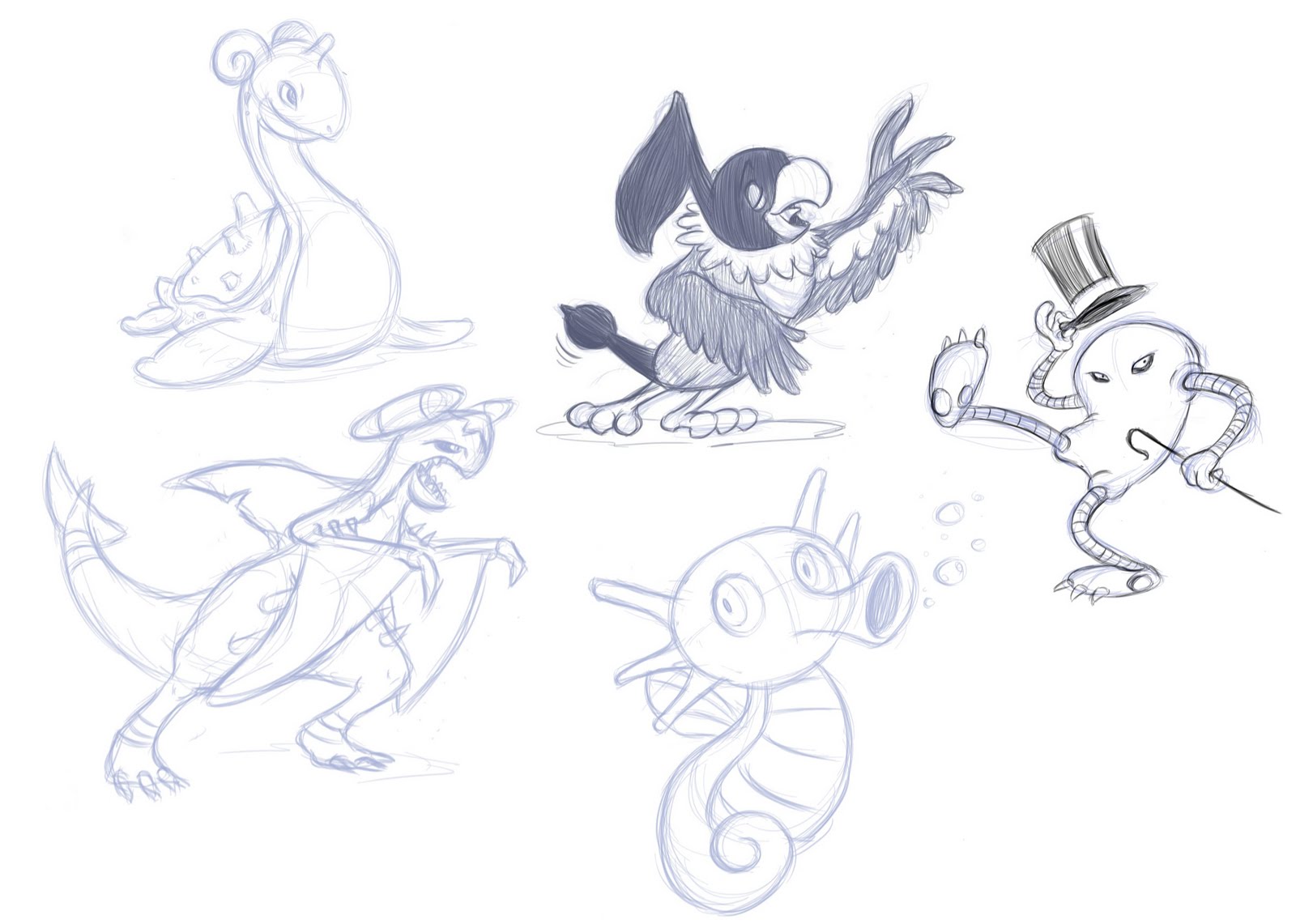
Ok, now that you've explained what the story is about, it's time to delve into things a bit further. Go into further details about your characters, your settings and any visual aspects of your concept. It's probably better to devote a page or two to each character, but hey, I was strapped of time and energy when I made these (each of these sketches were done in about 4 minutes):


It's also good to include model sheets of the characters, as well as a line-up to show their sizes in relation to each other. You should also devote pages for possible secondary or tertiary characters, backgrounds/settings, props, etc. The more you have, the more the potential buyer can latch onto.

#5) Episode Premises

If your developing a TV show or something that's planned on having multiple episodes or stories, you should include some examples of possible storylines or episodes. Just like with the main summary, write each episode out in very general terms. Think of an episode summary like a slightly more-elaborate TV Guide listing:

For a TV pitch book, it's good to have at least 6-8 examples. Like I said earlier, the more you have, the better.

And finally, there's the...

#6) Bio Page

You've told them all about your concept, your characters, your episodes... Now it's time to tell them more about YOU. Here's your "About the Author" page. Talk about your accomplishments, your experience (previous jobs, projects, etc.) and what you like to do. Don't write your life story, just give them a taste of who you are and what you do. For once, here's where you can appropriately brag about yourself. And don't forget to put a picture of yourself there too.

------------------

My pitch book is more like a pitch pamphlet, but it gets the point across. If I was making a REAL pitch book and not just an assignment to pass the class, I would've put so much more time and energy into it. More pictures, more pages, more write-ups... but that's for another time.

Also, just to make sure:

ALL CHARACTERS, CONCEPTS AND ARTWORK © MICHAEL J. RUOCCO - 2010
ALL RIGHTS RESERVED.

Option+G, what would I do without you?

Sunday, December 26, 2010

Socializing at the Thirsty Gull

Here's a picture for a pitch book I made for my Animation Law class (which I'll post a few pages of later on). I consider this the 'highlight' of the assignment, not because of I'm proud of the drawing...


...but because I'm proud of Shannon's superb job coloring it! She really brings depth and atmosphere to it.


She uses an old Wacom Graphire Tablet. I had a Graphire years ago, and it was a real terror to use. She's been using her's for years, and now it's barely holding itself together. So for Christmas, I splurged and bought her a brand-spanking new Bamboo tablet. She's enjoying the hell out of it, and I'm definitely glad she is.

I hope you all had a good holiday too!

Sunday, November 28, 2010

In case your wondering, he's reading "Love's Captive" by Mrs. Arabella Richardson and drinking a Boston Cooler.


When you hibernate in a hotel suite for a few months, you're bound to rack up a hefty bill.

Wednesday, November 24, 2010

Preparing for Bed

Lately, I've been drawing more fleshed-out scenes rather than a page of random nonsensical doodles all over the place.

Here's one of my better ones:


And Shannon, being the gracious and loving helperton that she is, colored it all up for me. I really admire her dedication and patience when it comes to color. She's gonna be an awesome professional colorist someday!


Saturday, October 30, 2010

Enticing?

I saw this at the supermarket earlier, sitting right next to a good ol' fashioned box of Maypo.

Cartoon product tie-ins have definitely come full circle.

Honestly, cream of wheat? Kids don't eat cream of wheat! In fact, I don't think PARENTS even eat cream of wheat!

Friday, October 22, 2010

Clipboards make good makeshift flipbooks...

While working behind the counter at the SVA animation studio, boredom started to creep in. So I picked up a ballpoint pen and started doodling on the Cintiq sign-out sheets. After 20 minutes, and 16 pages, I ended up with this.


The best animations stem from sheer boredom.

Tuesday, October 19, 2010

EXTREMELY ORIGINAL LOOKING PHOTOGRAPH


I needed a picture for SVA's Dusty's program book. Luckily, Zach was around to bail me out. (Thanks again, man!)

I thought it would also make a good photo ID for the various places I'm found all over the internet. Blogger, Twitter, Facebook... all that crapioca.

Saturday, October 16, 2010

Animatic Sneaks

I've been busy as hell these past few weeks (and will be for some time to come), so here's a couple sneak peek images from my recently finished "revised" animatic to tide you over.


I've made a few important changes throughout the film, so consider about 45% of the previously-posted storyboard to be "obsolete". Also, I cut a minute's worth of footage out, which makes me really happy.

I've been using Toon Boom Storyboard Pro for the animatic, which I can only describe as "Godly". It's easy to use and loads of fun to work with. It makes making animatics so much easier. Another nail in the coffin for FLASH.

Friday, October 1, 2010

The Early Work of Glen Keane

Here's a new discovery (at least for me): an early piece of animation by Glen Keane for a dog food commercial, made by Bob Kurtz' studio in the early 80's. I guess this was while he was briefly working freelance in between productions at Disney (?).


This his been on Kurtz' youtube channel for over a year. How this wasn't brought to my attention immediately after it was posted remains a mystery. Simply wonderful stuff (even if the "burger" portion of the dog food looks more like a bowl of worms).

Friday, September 10, 2010

Orphan's Benefit - A Comparison

Here's a side-by-side comparison of "Orphan's Benefit", a black-and-white ∂isney cartoon made in 1934 (left), and then remade in color 8 years later in 1941 (right).

I don't understand why they did this. Why would they put so much time, money and effort into a remake when they could use that same energy on making something original? Was it because of the big Disney strike that happened a few months earlier? Were they planning a package feature of remade shorts which never fully came to fruition? If anybody has any information on the history of this, I'd love to know more.

I apologize for the interlacing issues in the video. When I get the chance, I'll reupload a better version.

Tuesday, August 31, 2010

Poke-Monstrosity


Years ago, I was REALLY into the whole Pokemon thing. I had everything: the cards, the figurines, the games, the videos... you name it. There even used to be a "Pokemon store" a few towns over from where I live, and I'd beg my mom to take me there every week. It was mostly cheap Chinese knockoffs or imported cards, but I still dove headfirst into the stuff. God, it was nuts. I could barely keep up with it.

Then one morning I woke up, looked at all the Pokemon paraphernalia I had strewn around my room, and had this "Oh God, what have I done?" feeling. I felt so guilty that I dragged my parents through all this. The money they must've spent on all that garbage. So I took all of it, put it in a big box and shoved it up in the attic. I looked online recently to see if any of my cards were worth anything, but its barely worth the paper they're printed on. The only Pokemon-related things I'll ever keep are the little figurines. They're still really cool to look at.

Looking back, I don't know why I got so hooked on it, like millions of other kids did at the time. Maybe it was just because everyone else was in on it, and I was just curious enough to get in on the act too. I have to admit though, the designs of these creatures are very appealing and original when you really look at them. AND IT'S STILL GOING! When I stopped, there was, what... like 200 of them, now there's over 500 of the damn things! How do kids these days keep track?

Recently, I was conversing with a few friends, and I asked them what I should draw. They named some random Pokemon I never heard of, so I looked up reference and drew it. Then somebody named another, and another and another.... so now it's become this regular thing, where I draw like 5 or 10 random Pokemon and compile them together. Here's a few of them


I wonder if Beanie Babies still sell...

Friday, August 27, 2010

Only he could pull it off...


Ok, opinion time...

I admire Milt Kahl. I mean, what aspiring animator doesn't? But honestly, there's one thing that I have to say about Milt Kahl; he was a real hammy animator.

Don't get me wrong, his animation has a stupendous feeling of movement, weight, timing and believability. He can pull that off better than any other animator in the business, and that's something that always inspired me about him. But that's also kind of where he falters. I think that's why he could pull of characters like Peter Pan, Madame Medusa and Tigger, and not more emotionally driven characters like Frank or Ollie's. A lot of Milt's characters seem self aware, like they know they're putting on a show. They really chew the scenery sometimes.

The one thing that really stands out of Milt's work is what I like to call the "Milt Kahl head swaggle", where the character does this jaunty little head-tilting motion as they speak, usually when they're proud or giving some sort of affirming comment. It seems to be a trademark of his. Part of me loves it, and another part of me is really bothered by it, I don't know why that is. It's a very cocky gesture, which maybe (I wish I could say this without sounding too hurtful) seems to reflect Milt's own personality a bit. It's an extension of Milt's character.

Maybe I'm putting way too much thought into this, or I'm not analyzing it as much as I should. After all, nobody's perfect. But nonetheless, I still love Milt's animation. Edgar from The AristoCats, Brer Rabbit and Tigger are a few of my favorite animated characters. In fact, his introduction of Tigger in Winnie the Pooh and the Blustery Day is probably my absolute favorite piece of animation ever. Despite being usually very broad, his more underplayed characters like Shere Kahn or Alice have subtleties that even the most skilled animators aspire to. He is indeed an animation Michelangelo.

*Warning - do not attempt a "Milt Kahl head swaggle"© without proper protection or supervision. Do not perform near sharp objects or an open flame. And never swaggle your head while intoxicated or under the influence of prescription medication.

Sunday, August 22, 2010

Influence Map

A recent meme template has popped up all over deviantART, and everybody seems to have jumped on the bandwagon. It's an "influence map", where you fill in the grid with things that inspire you. The larger the picture, the more inspiring it is/was to you. Since all my friends were doing it, I thought it would be fun for me to get in on it too.


(click to enlarge)

I kinda went a bit overboard, but that goes to show how many different things inspire me as an artist. There's a lot of things that I left out, like music and literary influences, but I thought I'd keep it strictly visual.

If you'd like to do one too, click here and download the .psd file. Have fun!

Sunday, August 15, 2010

My Thesis Storyboard

Here's the first draft of my storyboard for my thesis film. If the drawings and descriptions are too small to see, click on them to direct you to my Flickr gallery, where you can see them full size. (I would put the larger size here, but the blog layout is too small for it to fit).


While drawing it out, I tried to make the drawings expressive and clear enough that you can pretty much tell what's going on without reading the dialogue or the action notes. It's a good thing to keep things like that in mind, since not everyone who'll eventually see my film will understand English.

I plan on making a revised, more fleshed-out version soon, but this was just to get things down on paper.

Wednesday, August 11, 2010

New Blog Banner

I never really thought my old banner was too good. I just put it up there as a temp. banner, and it ended up staying there for over a year. So I finally got around to making a new one.

I sketched this doodle of Randy kicking a pine cone...


...scanned it into the computer, cleaned it up in Sketchbook Pro...

... sent it over to Shannon to color (who did a fantastic job as always)...

Put it into a banner template, added text and VOILA! I liked the rough a lot, so I thought it would look keen to put it in the background too.

I really like how this drawing came out. I think there's some good flow in it. It feels more natural. Plus it's actually cleaned up, which I rarely have the patience to do usually.

And for those who miss the old banner, here it is, in all it's rushed, Flashy glory.


Friday, August 6, 2010

Deleted Freddie Moore Animation from Dumbo

When I have nothing else better to do, I scour the web looking for things that inspire me. If I like a certain artist, I'll make a new folder on my hard drive and collect their work onto it for future reference. If I see a painting or drawing I like, I'll study up on the artist and look for other works of theirs. At the time of this post, I have over 130 folders full of artwork, along with countless "unknowns" that don't have folders. I have just over 2GB of images just of other people's stuff. And the content ranges from famous painters to fellow classmates at SVA. If I like it, I study it.

One of the places I regularly browse through is eBay. At this point, I figure "Why would I want to spend hundreds of thousands of dollars on a single drawing that will sit in a file cabinet for years collecting dust unseen when I can just snag the image of it that's posted on the auction page and I can admire it just as much for free?" Sure, a lot of them have watermarks on them, but that won't stop me from appreciating the image behind it. But I digress...

So what does this all have to do with Timothy Mouse?

Earlier today, I was browsing through eBay yet again when I came across a pretty nice find. Somebody was individually auctioning off about 30 sequential drawings by Freddie Moore of Timothy Mouse from Dumbo... for $450 each (and that's just the starting bid). So what did I do? I snagged them.


Curiosity getting to me, I put all the drawings together in Quicktime and played it back. Magic!


Then I noticed the stamped numbers in the bottom left corner of each drawing, "2006 19.2 30.0". Recalling Hans Perk's drafts for Dumbo, I remembered what those numbers mean. 2006 is the production number ("Dumbo"), 19.2 is the sequence number ("Dumbo Learns to Fly") and 30.0 being the shot number. I went over to Hans' site and checked his drafts. There was the shot, but between when the draft was made and the film's release, the end of the sequence was changed. There originally was more lines by Timothy and a "confidentiality agreement" between him and the crows. In the final film, this scene was truncated, leaving out all of Timothy's extra dialogue.

To see all 28 drawings up close, go here to my Flickr page.

Thursday, August 5, 2010

A Little Background Work

Production on my thesis is revving up pretty soon, so I need to prepare myself for the oncoming onslaught of work that I'll be focusing on for the next 9 months or so. One of the things I'm working on are my background designs. Since landscapes and stuff like that aren't my forte', I need plenty of practice.


These two were roughly based on 2 scribbles I did in my storyboard. I sketched them out in about 10 minutes (each) and then sent them over to Shannon to color them for me. And she did a fantastic job of it, too! She told me that she never really colored backgrounds before, but these are marvelous for a first time. She'll definitely get plenty of practice at it, I'm sure!

While I'm definitely satisfied with the way these two came out, they're still experimental. I'm not quite sure which way I plan on going as far as execution. What I'd really like to do is make them look like something out of a Disney Winnie-the-Pooh feature. I find those to be the most charming and welcoming backgrounds Disney ever did. You just want to walk through that forest. Check out a few here at Rob Richard's fantastic blog!

Here's a few examples from Pooh's Heffalump Movie that I quickly snagged.


I don't wish to go into THAT much detail in my thesis (I'd never finish it if I even attempted to), but this is what I'm using as a reference to inspire me. Its sort of a point to bounce off of.

Over the course of the next year, I plan on posting bits and pieces from my thesis as I go. Backgrounds, storyboards, concept art, rough animation tests, etc. So consider this place a "production blog" from now until next May.

Tuesday, July 27, 2010

The Dodo and the Darling


Here's the colored version, done by Shannon.


I can imagine hugging Randy would be like hugging an overstuffed pillow, or a bean bag chair filled with memory foam.