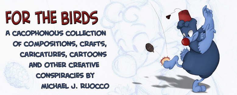
I never really thought my old banner was too good. I just put it up there as a temp. banner, and it ended up staying there for over a year. So I finally got around to making a new one.
I sketched this doodle of Randy kicking a pine cone...

Put it into a banner template, added text and VOILA! I liked the rough a lot, so I thought it would look keen to put it in the background too.
I really like how this drawing came out. I think there's some good flow in it. It feels more natural. Plus it's actually cleaned up, which I rarely have the patience to do usually.
And for those who miss the old banner, here it is, in all it's rushed, Flashy glory.


1 comment:
Very nice addition.
Post a Comment