Okay, lemme try making a more insightful post, rather than a "Hey, look what I did!" dog and pony show.
I just completed the 1st semester of my final year in college (wow...that went quick), and we've all been working on our thesis films. Because thesis takes up a good chunk of our time this year, the 4th year animation class schedule is much more limited compared to previous years. Besides thesis (which technically counts as a class, oddly enough) and any humanity, art history and/or elective classes that we neglected to take care of, there's only one other class each semester, the first being "Animation Law". It's pretty self-explanatory really. Copyright, lawyers, agents, all that legal mumbo-jumbo... at least thats what you'd expect from a class called "Animation Law", but I'm not going to open that can of worms today. That's a story for another day.
There were two assignments we needed to do to pass the class. One was to interview two animation professionals currently working in the business. Graciously, John Canemaker was kind enough to take time out to talk with me, but again, that's a story for another day. The other assignment was to create a pitch book.
-------------------------------------
For those out of the loop, a pitch book (or bible, depending on how devout you are) is a "pitch" to sell an idea or concept to a possible buyer or investor. Let's say you have an idea for an animated series and now you want to convince a studio or network to consider your idea, and if all goes well, pick up and produce your series. So how do you do that? With VISUAL AIDS of course! Lots of pretty pictures for network executives to ogle at, to give them the feeling that what you have will be the next Spongebob Squarepants or Phineas and Ferb, and eventually take it and turn it into other money-making cash cow of a franchise to milk 'til it's bone dry!
What? Too far? Ok, let me put it another way:
Think of your pitch book as a catalog. You have a product and you want to sell it. What do you use to grab the buyer's attention? Of course, cool pictures will grab their eye, but what will ultimately make them take the next step and actually buy it? Now it's your job to play the role of a salesman/storyteller to give them as much information to latch onto to convince them that they're getting more bang for their buck. So what do you give them?
Here's a bare bones outline of a pitch book:
1) Cover Page
2) Contact Information
3) Concept Summary
4) Character Bios & Line-up
5) Episode Premises
6) Bio Page
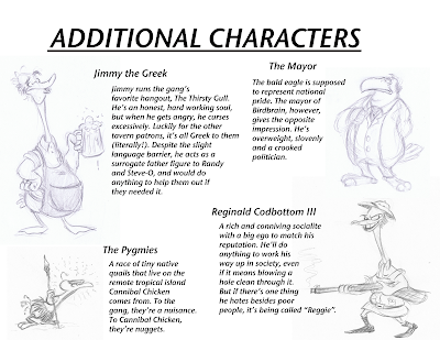
You can make a pitch book for a variety of things. For TV shows, for movies, for toy-lines, ANYTHING. For my pitch book, I decided to pitch a comic book series, like Asterix or Tintin, using my original characters. While it is a book series, it still follows the same basic guidelines of what a TV show pitch book would have. Below are select pages from my own pitch book. I omitted several pages because they had personal information on them, which would've included page #1:
#1) The Cover Page:
You know the phrase "Don't judge a book by it's cover". Well, that doesn't quite apply to a pitch book. Consider this: somewhere in Hollywood, a network executive/agent has 12 zillion pitch books piled up in his/her office. Among the endless plethora of possible TV series/movies/comics, what will make your pitch book stand out from all the rest?
The cover page (or title page) is what will initially grab the reader's attention. It's the eye-grabber that will want to make whoever's reading it want to stay and learn more about what you have to show. Your book doesn't have to be just black-ink on white paper. Get as creative as you want! Personalize it! I've heard stories of people decorating their pitch books in the most outlandish ways. Covering it in feathers, making it a pop-up book, burning the edges of the paper... You name it, somebody probably already did it. And sometimes it's not just the cover. Some people do it to the whole book. One of my classmates made her pitch book look like a crime case report, while another made her pitch book like a child's sketchbook done in crayon. It can be as imaginative as you want it to be.
For my pitch book, I combined 2 pages into one: The title page and...
#2) Contact Information
There have been stories of pitch books sent into a studio and were really great, but the bonehead who made it didn't put any of their contact information on it! "Who made this pitch book?!" Here's where you list all your contact info so whomever sees it can get back to you:
Your Name
Your Email
Your Phone Number(s)
Your website address
Your blog
etc.
It's up to you what or how much you want to put there. Also, this would be a good place to put down your copyright information, like this:
All characters, artwork © John Doe 2010
All Rights Reserved
*Also, in case you were curious, you can type a © if you press Option+G on a Mac.
#3) Concept Summary
Who? What? Where? When? Why? How?
Okay, what is your idea? Who are the characters? Where does this all take place? Here's where you describe your idea, either in a broad or detailed way. I like to think of it as the back cover of a video or the insert inside a book cover or the summary on a Wikipedia page. It tells the reader what they're getting into and what they should expect. Here's the back to a DVD that was within arm's reach:
"The clues are in, the chase is on, and the case of the century is about to break wide open in Disney's greatest little mystery in history! Let the creators of Aladdin and The Little Mermaid take you on an adventuresome journey through the cobblestone streets of 1887 London, where some suspicious "mousechief" is the suspenseful start to this thrilling musical adventure.
Olivia, the brave daughter of a beloved London toymaker, turns to Basil of Baker Street for help with her father's disappearance. Basil's jolly assistant Dr. Dawson and loyal dog Toby lend a hand...and nose... as they sniff out clues through their charming miniature world. The final chase leads to Professor Ratigan, a hardhearted criminal whom Basil must outwit to save all of Mousedom! ... full of unforgettable characters and spectacular animation - all leading to a climactic climb atop Big Ben - it's elementary who you'll want to watch again and again... The Great Mouse Detective!"
"Wow! "Adventurous journey"? "Cobblestone streets of 1887 London"? "Climactic climb atop Big Ben"? Oh my sweet loving saviour! I'm so curious, I want to see MORE!"
In two paragraphs, the story, the characters and the setting are all briefly summarized, and now you know that you're going to see a movie about crime-solving mice rather than aliens, zombies or teenage vampires.
Here's my very brief summary page:

For your summary, you can also include your inspirations, what you expect to give and/or who this particular movie/series/toy is aimed towards (or demographic). Here's mine, which I put on it's own page with some FULL-COLOR ARTWORK to further grab your attention!


#4) Character Bios & Line-Up
Ok, now that you've explained what the story is about, it's time to delve into things a bit further. Go into further details about your characters, your settings and any visual aspects of your concept. It's probably better to devote a page or two to each character, but hey, I was strapped of time and energy when I made these (each of these sketches were done in about 4 minutes):

It's also good to include model sheets of the characters, as well as a line-up to show their sizes in relation to each other. You should also devote pages for possible secondary or tertiary characters, backgrounds/settings, props, etc. The more you have, the more the potential buyer can latch onto.
#5) Episode Premises
If your developing a TV show or something that's planned on having multiple episodes or stories, you should include some examples of possible storylines or episodes. Just like with the main summary, write each episode out in very general terms. Think of an episode summary like a slightly more-elaborate TV Guide listing:

For a TV pitch book, it's good to have at least 6-8 examples. Like I said earlier, the more you have, the better.
And finally, there's the...
#6) Bio Page
You've told them all about your concept, your characters, your episodes... Now it's time to tell them more about YOU. Here's your "About the Author" page. Talk about your accomplishments, your experience (previous jobs, projects, etc.) and what you like to do. Don't write your life story, just give them a taste of who you are and what you do. For once, here's where you can appropriately brag about yourself. And don't forget to put a picture of yourself there too.
------------------
My pitch book is more like a pitch pamphlet, but it gets the point across. If I was making a REAL pitch book and not just an assignment to pass the class, I would've put so much more time and energy into it. More pictures, more pages, more write-ups... but that's for another time.
Also, just to make sure:
ALL CHARACTERS, CONCEPTS AND ARTWORK © MICHAEL J. RUOCCO - 2010
ALL RIGHTS RESERVED.
Option+G, what would I do without you?


6 comments:
Wow dude, that was very insightful! I read through the whole thing, thank you for this post! I already have piles of concept artwork for my thesis, but Im not confident that they are pitchbook worthy, they're mostly edge to edge full page scrawls haha.
When will your story premises turn into comics or animated episodes?
I'll probably try and do the 1st book again after my thesis is over (in April/May).
I drew out about 50 rough pages of the first story, but I threw it all out last year. I'm gonna start over.
I wanted to ask you how much text should be on a slide for a great pitch book. as even when i do little i get told somethime that there is too much on the page still!
be interested t her another persons perspective.
I guess it would be good to have enough to explain the jist of the concept/characters/etc. without it turning into a giant wall of text. Big paragraphs scare people.
It's always good to keep things short, sweet and insightful. To compare to my pitchbook, I'd say put a little more information for who the characters are, what the premise of the story is and what you are aiming for with it than what I made here.
I'm sorry if my response isn't very helpful. I'm just as new to pitchbooks as you are! :D
i just wanted to reiterate the earlier comments by saying, i really appreciate you posting this. It's easy to think your pitchbook looks good, and you can run it by a million people, but there's nobody to really run it by. But just having like pieces and similarities to your book, really helped by boosting my confidence. Thanks.
Post a Comment