I never really made comics before, maybe a small 3-panel strip for Hofstra Saturday Classes, but nothing more. I never really was into comics that much, either. But after seeing strips like John Sanford's Chippy & Loopus & classic strips like Calvin & Hobbes, I felt inspired to eventually create a comic of my very own. Here was the perfect opportunity to make that a possibility.
I started out with a small sheet of printer paper, thinking I wouldn't make anything bigger than that. Sadly, I didn't have the right story to tell or any space to tell that story. Since I was suffering from "cartoonist's block", I decided to write the dialogue first & figure out how many panels I'd need to draw everything out. It seemed simple enough.
But I was missing one thing: an idea. After juggling a few things around, I finally found what I wanted: what if my duck Steve-O met Shakespeare? How would he react to him? How would Shakespeare react? What if Shakespeare had writer's block like I did & Steve-O helped him out (for better or worse)? It seemed perfect.
I thought I would need only 4 0r 5 bits of dialogue to get the story across, but I was wrong. When I started writing the dialogue, I wrote it like a bad TV writer:
"Hello William Shakespeare. How are you?"
"I'm sad"
"What's wrong"
"I don't know what to write etc, etc, etc..."
I realized that both Steve-O & Shakespeare should have conflicting personalities & speech patterns. Steve-O would be Costello to Shakespeare's Abbott. Straight vs. Funny. So that led to:
"Hiya, Billy Boy! How's things?"
" What...oh... hello my good Stephano. Not very well, I'm afraid." etc...
I kept rolling with that idea, one joke after another, & I ended up with 3 pages of dialogue, which added up to about roughly 20 panels. I was going to need more paper.
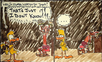
I settled for bigger paper. I made it into a poster-sized epic. After a few hours of layout, drawing, inking & coloring, I ended up with this:
A 2' x 1' nightmare.
I really liked it when it was in black & white, but once I colored it, I despised it. I regretted using markers (that's all I had) & I should've switched the floor & wall colors. It's in a sea of dark brown. I suffer from slight color blindness, so coloring my drawings frustrate me.
I really liked it when it was in black & white, but once I colored it, I despised it. I regretted using markers (that's all I had) & I should've switched the floor & wall colors. It's in a sea of dark brown. I suffer from slight color blindness, so coloring my drawings frustrate me.
Since I'm having problems with the sizing of pictures on this site, I'll post each panel individually. I think I've figured it out, but I'm not sure. I apologize for the blurry pictures, slight cutoffs, bad coloring & horrible lettering. Click each picture to enlarge (I hope).


5 comments:
Hey Mike! Great start! Your poses are expressive, and fun to look at!
The markers do hurt the legibility, but you know that already so I will move on to my other thoughts.
The first: brevity. You can write dialogue, that much is clear. However, next time, try to do it with less. Look at everything you write and try to boil it down to as few words as possible. Brevity will help your comedy.
Second: You actually have 2 ideas here. You could have written 2 short strips on this idea instead of one. Strip one could have been the story pitch and Steve-O's reaction, and strip 2 is Steve-O's notes, ending with "I don't know,make him a black dude or something.
My advice is to keep doing them! Do one, learn from it, and then try to apply what you learn to the next one.
Good luck! You are on your way!
Hey Mike,
Great comic. I thought it was hilarious. What I particularly liked was that the comedy was drawn from the characters well conseived personalities bouncing off of eachother. You were able to invent a personality for Shakespeare that was believable and suited the needs of your comic. And Steve-o is Steve-o.
I do comics myself and I can say with experience that writing dialogue becomes easier the more you do it. Cartoonists have different ways in which they get their dialogue, some such as myself think up the lines before I begin to draw. Scott Adams the guy who does Dilbert says that he often has a vague notion of what he is going to do or has some lines of dialogue prepared, but will often let the way he draws his characters decide how the strip will run. Such as if he draws a character too relaxed by accident the characters lines will be ammended to be more relaxed.
Your strip will decide for you how it is written, and you definetely don't need any advice from me. I'd love to see more comics up on this site, your characters are really funny and pleasing to the eye.
Not to nitpick, but in your first frame you repeat the word "of" twice when I guess you meant "one of." Oh and thanks for posting the frames one by one, clicking on them did enlarge them. And again It would be great to see more comics.
Oh and one last question, is there any particular reason why you made Steve-O yellow, as opposed to green like a mallard. I'm just curious.
Your Fan,
David Spector
-Hey Dave, thanks for the kind words! Since I am new to this comic thing, I need to learn as I make each strip. I guess practice makes perfect.
You're right; I did make a typo on that 1st panel. It's too late to fix it now, but maybe I'll sneak into class next week & fix it incognito-like.
As for Steve-O's sunny plumage, I just thought he looked better in that color. I tried green & I didn't like it very much. Then I tried white (too pale), then I tried random colors (red, purple, brown, black, etc.), & none of those looked right. Yellow seemed to fit the best. It sort of contradicts his personality. He's usually sarcastic, slightly narcissistic & has little bits of brashness, toughness & just plain haphazardness in him, but outside he's a sunny, bright & cheery-looking duck. I found out months later that only baby ducklings are yellow & that they change color as they age, but who really cares, it's a cartoon.
Thanks again for the complimentary comment!
-John, thanks for the tips. I just bought a gigantic set of colored pencils, so I never shall touch a strip with a marker like that again.
Since this was for a class project, I had to have it all on one large sheet so I could get full credit. I knew, even when I was drawing it out, that I would only do a few panels or if I decided to do a regular comic. & next time I'll keep the dialogue short, sweet & to the point. Milk the idea dry. Thanks again!
After hearing such nice comments & after some thought, I decided to make comics a staple of "For the Birds". I have a few other ideas up my sleeve, & I'll test them out here & see how they do. Thanks again Dave & John for the help!
Cousin Mike,
I have been reading through your Blog since I got home from the bone yard earlier in the day.
Some very cool stuff! This is the first time I ever visited a "Blog" and find the medium quite interesting. I think it's a great way for you to network with other people with the same interests. I am certain that you could & will meet some excellent contacts that you will use to help further your education in the art of cartooning.
I will be back for some more visits in the future. Perhaps you could come up with a Pharmacist character in dedication to your namesake cousin.
Take care, and keep on exploring!
Cousin Mike! Glad you liked it!
A pharmacist character? Hmmmm... sounds interesting enough. I'll include a pharmacist in my upcoming "For the Birds" strip. I'll do some rough designs later today.
Post a Comment