Showing posts with label banner. Show all posts

Wednesday, August 11, 2010

New Blog Banner

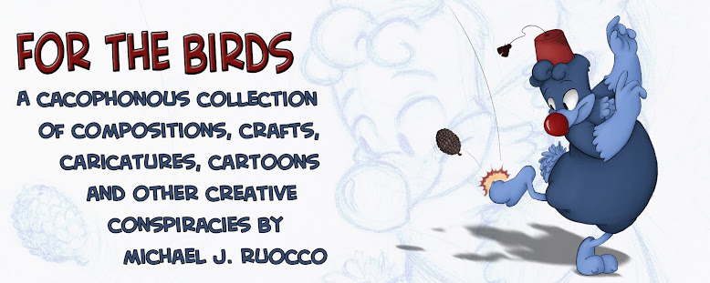
I never really thought my old banner was too good. I just put it up there as a temp. banner, and it ended up staying there for over a year. So I finally got around to making a new one.

I sketched this doodle of Randy kicking a pine cone...


...scanned it into the computer, cleaned it up in Sketchbook Pro...

... sent it over to Shannon to color (who did a fantastic job as always)...

Put it into a banner template, added text and VOILA! I liked the rough a lot, so I thought it would look keen to put it in the background too.

I really like how this drawing came out. I think there's some good flow in it. It feels more natural. Plus it's actually cleaned up, which I rarely have the patience to do usually.

And for those who miss the old banner, here it is, in all it's rushed, Flashy glory.


Sunday, May 31, 2009

For those of you who didn't notice, I finally changed the headline banner for the blog. I just realized that Fall was over. Why doesn't anyone TELL me these things?!

I originally planned to change the banner for every season. I did one for last summer & did one for the fall, but because of college & other more pressing matters, I never got around to making a new banner. So the fall banner sat all through winter & spring, 'til yesterday when I finally got fed up & scribbled this out in 20 minutes, just to change things around.

I'll keep this one up 'til the end of the summer (or when I better idea for a design comes along). 'Til then, enjoy me & my tarantula-leg eyebrows for a few months.

By the way, here's the old model, just in case some of you miss it already:

Wednesday, August 27, 2008

Like the New Banner?

Well... I became inpatient... so I decided to put the new banner up a few days early. Whattaya' think?

I roughly sketched about 15-20 different thumbnail designs for the new banner until I finally came up with a layout I liked. Some other concepts were the three guys raking/jumping into piles of leaves, walking through the woods & harvesting. I briefly considered doing holiday-themed banners for Halloween (pumpkin carving, trick-or-treating, etc.) or Thanksgiving (turkey dinner, football, etc.), but I decided against those ideas believing I should focus more on fall itself & not the holidays. One idea that I liked a lot was one of Cannibal Chicken catching leaves with his tongue as if they were winter snowflakes, but I scrapped that at the last minute 'cause I couldn't plan it out right on paper.

I finally came up with a concept I liked: pumpkin picking. I then drew a larger rough draft to plan out the composition & poses in the scene. The only difference in the original draft & the final draft up top is that Steve-O was originally the scarecrow instead of Cannibal Chicken, but once I thought of adding the crows at the last minute, I knew Cannibal Chicken would fit better with them. I also added the fence, barn & tied bundles of stalk later on.

Then I began to draw the final draft. The actual drawing is about 10.5" wide & 4.5" high. I first drew it extremely rough in blue pencil to lay out the characters & objects in the scene , then went over it once more in green to pinpoint & clean up the lines. Then I began to ink the drawing:

Here's what it looked like about halfway through the inking process. Notice the light green & blue lines underneath before I erased them later on:


Once the inking was done, I erased all the green & blue pencil lines & shaded the drawing in black Ebony pencil. I like to do that because it gives the drawing a nice sketchy texture underneath the color, almost like an old book illustration:

Then comes the fun part: the color. Surprisingly, it ended up being a lot easier than I thought it would be. The only difficulty I had was coloring the pumpkin patch & the corn & bundles on the left. It ended up consisting of about 15 layers, from the purple & cream sky on the bottom to the shadows on the top.

Overall, I'm very satisfied with the way it came out. There aren't as many noticeable mistakes as the last banner & I think the poses & colors are a bit stronger & more defined here as well. It's definitely an improvement over my summer banner & I'm looking forward to it being the first thing I see when I check my blog for the next few months. I hope you think so to!

More to come soon!

Monday, August 25, 2008

Back Again...

Hiya folks! I just got back from West Palm Beach & although Ol' Tropical Storm Fay stuck around Florida for a while (& apparently still is), the weather was actually a lot sunnier than I expected. Lucky me!

Anyway, continuing where I left off, I'm now in the process of creating a new banner for the blog to commemorate the beginning of the fall season. Now I know most calenders say that Autumn doesn't technically start 'til late September, but I always felt that it started right when school did, so THERE! Take that, Gregorians!

At this point, I'm only up to the rough blue pencil stage of the process, but the inking should go by pretty quick too. The hardest part is the coloring! Sure, Photoshop makes coloring my sketches a cinch, but when you're partially colorblind (only alittle bit) & it takes you a few hours to color all the separate layers, it definitely requires plenty of patience. Boy, all those red, yellow, orange, brown & gold leaves are gonna be a LOAD of fun to color one by one... & I hope I can get that, along with all the other important crap, outta the way by this coming weekend. I'm movin' back to good ol' 318 at SVA this Saturday!

The temporary banner I have up now was cobbled together from a picture I made in response to some of my friends recent "alternate color scheme" pictures. Here's the original:

Oh, & if you miss the old summer banner, don't worry! Here it is!:

By the way, I have plenty of Florida drawings to post (which reminds me, I still haven't posted any of the camping drawings I did a few weeks ago!). Expect those within' the next few days!

& here's a reminder to everyone!... so far I've only gotten 2 great submissions to my companion blog, "DUCK!". The gallery must grow, people! If you want to submit your own ducky piece of original artwork, click on the "DUCK!" link on the right & read the rules. REMEMBER, WE NEED YOUR SUPPORT!
Wednesday, August 20, 2008

Goin' Out Again...

I'm goin' down to not-so-sunny Florida for the next few days to see the folks, so this blog won't be updated 'til I get back on Monday.

In the meantime, enjoy the temporary blog banner I quickly cobbled together & posted above. I'm working on a new banner for the Fall season, which I plan putting up on the first day of September. 'Til then, enjoy Steve-O & his 7 designer colors.

I bid you all 'Adieu'!

Tuesday, June 17, 2008

For the Birds Summer Blog Banner

You probably all noticed the brand-spankin' new banner I made for the top of the page a few days ago. I thought the blog needed a little summery touch, so I made it & put it up to ''brighten the room''.

I originally was going to do the whole thing, drawn & colored, in Photoshop. But when I got to the point you see below, I realized that it just didn't look right to me. I can't seem to get that spontaneous & organic quality from my paper drawings using a tablet. So I decided to start from scratch the good old-fashioned way: with paper, pencil & pen.

I roughly re-sketched the layout from the computer version on paper & inked it using my favorite pen, a Size 1 Pigma Graphic Pen. I like to ink my characters with big, fat, juicy lines. The only problem I have with these pens is that they dry out SUPER quick. I can barely get a day's worth of drawing out of it. I go through a LOT of these pens, 2 bucks a pop.

After erasing my pencils & scanning the drawing in, I colored it all in Photoshop. The hardest part to me was all that #$*&! sand! Besides that, the only other things I added to the drawing in Photoshop were the clouds, the sun & my name.

There are some things I like better in the rejected tablet job than the final inked version. In the tablet one, Cannibal Chicken's pose is a bit more pushed out & Randy looks just the way I like him. The inked Randy's head looks a bit too 'dumpy', I should've had his head tilt back like I did in the other one. Well, it doesn't matter now, it's all in the past. What's done is done.

Oh, I for those who miss the old banner I had up before, here it is: